VARUNA JAYASIRI

@vpj

Forestpin Enterprise Redesign

November 27, 2013

We released the new version of Forestpin Enterprise last week. The new version is a complete rewrite of both the backend and UI. The backend was rewritten to be faster and to introduce a bunch of new features and analytics. The user interface was redesigned to be much more user friendly and also with focus on mobile devices such as tablets.

Teachings of visualizations experts such as Edward Tufte, Stephan Few and Naomi Robbins were followed during the user interface redesign. We have also changed the way we presented the results of analyses that existed in previous version as well. The images below are screenshots of the new version vs. the previous version and what made us make the changes.

Benford's Law Analysis
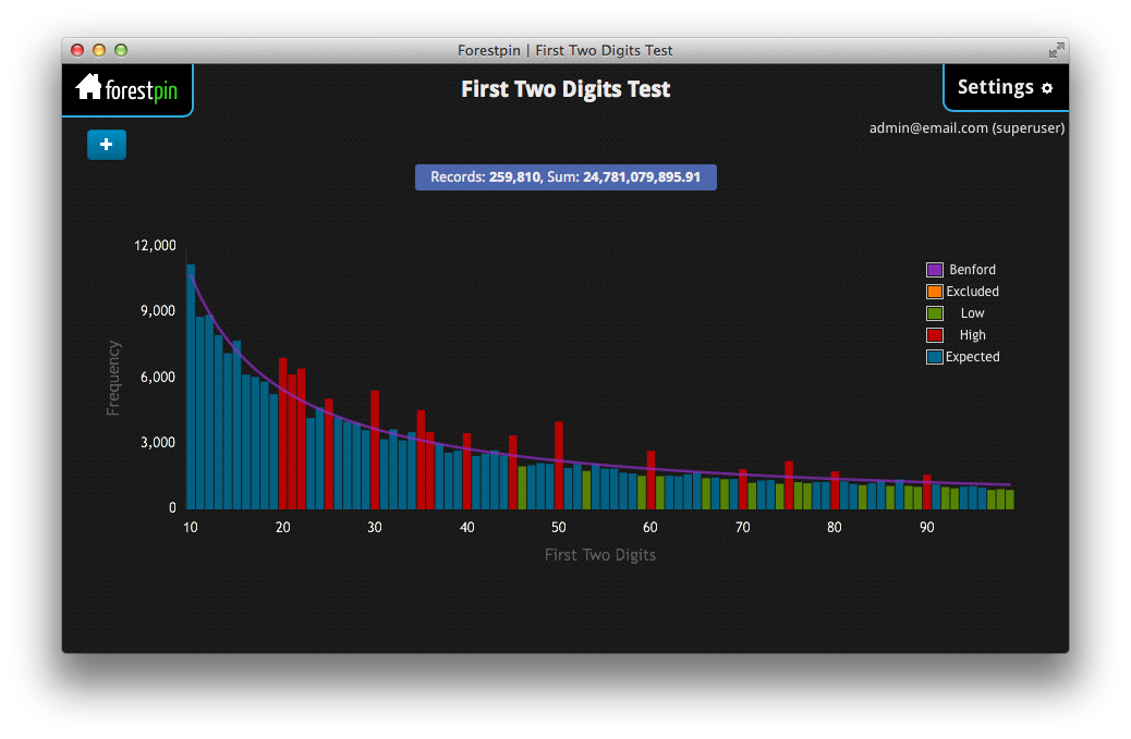
Benford's Law Analysis - Old

In the previous version you could only see the distribution of number of transactions for each first two digit combination, whereas in the new version we display the distribution of the sum of values by first two digits. We are using the concept of top-down graphs to show two different related values, so that the users can come to better conclusions.
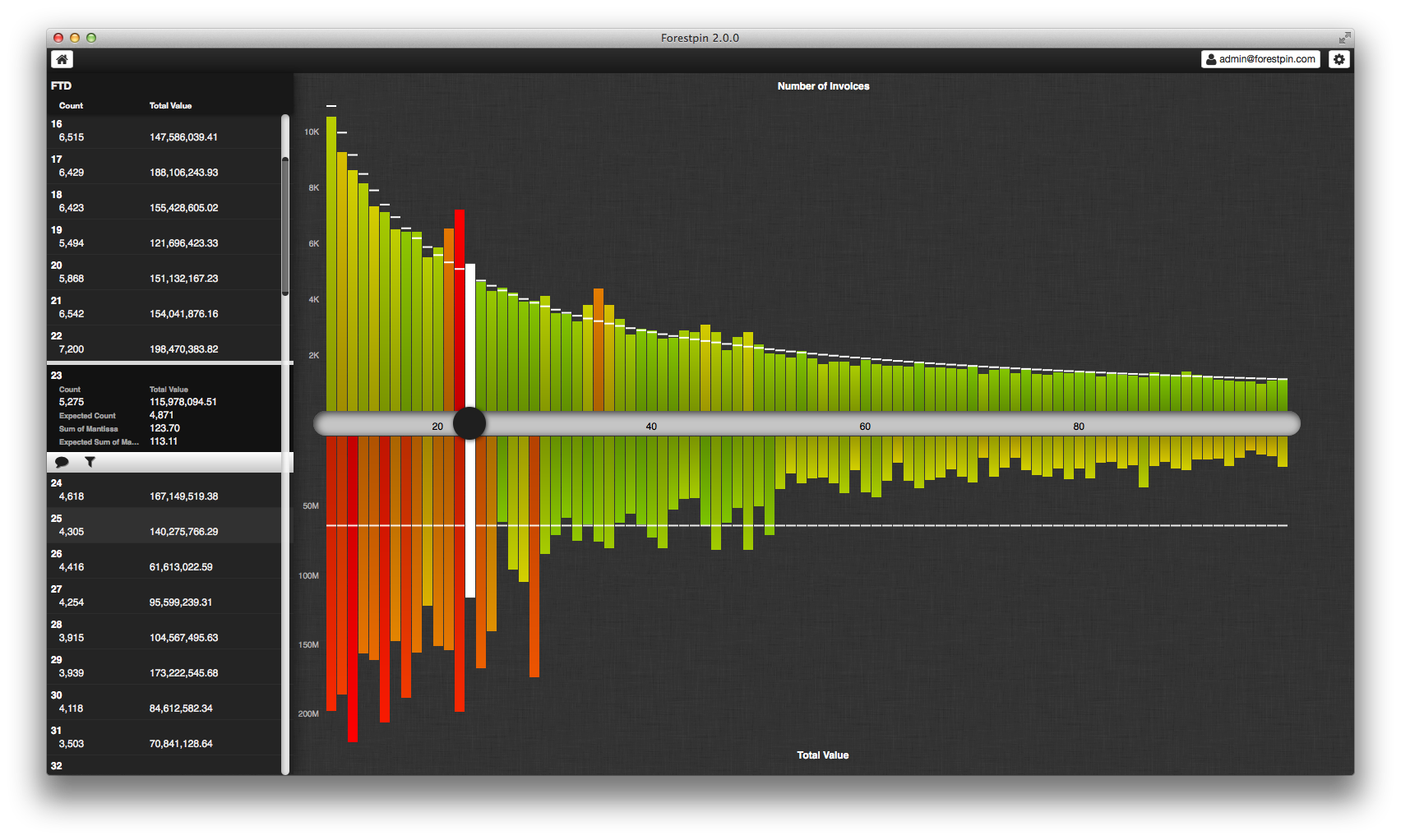
Benford's Law Analysis - Redesign

For instance, with this top down display one can easily figure out that the spike in summation test at 29 (the downward orange bar) is due to a set of large valued transaction and not because there is a high number of transactions with FTD 29 (no spike in frequency distribution). Also we have colored the bars with a range of colors, unlike 3 colors in older version, to indicate the deviation. This makes it very easy to spot the red flags.

Duplicates Analysis
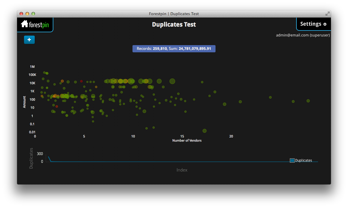
Duplicates Analysis - Old

Many found the duplicates analysis in our previous version very useful; they also found the visualization very pretty. Still it could be improved. In the redesign, we have introduced a column on the left hand side to show the details (value, number of repetitions, average date, etc) about possible duplicated transactions. This is very useful to spot suspicious duplicates if you are familiar with numbers and the transaction values look odd. For instance, although you can infer the rough amount value from the position of the bubble you will have to select the bubble to find the exact amount.

Moreover, as you can see, we have also introduced sorting which is very useful in analysis duplicates, with our backend rewrite you can sort duplicates by different attributes almost instantaneously.

Account Based Analysis / Relative Size Factor Analysis
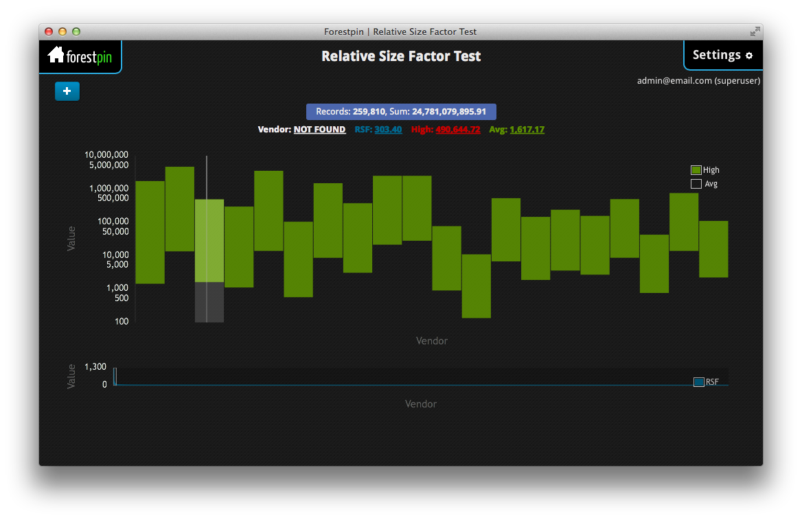
RSF Analysis - Old

The above visualization shows vendors with highest relative size factor; that is vendors with unusually large payments. The graph is in log scale with bottom being the average transaction value for each vendor and top being highest transaction value; therefore, the height of the bar is proportional to the log of RSF.
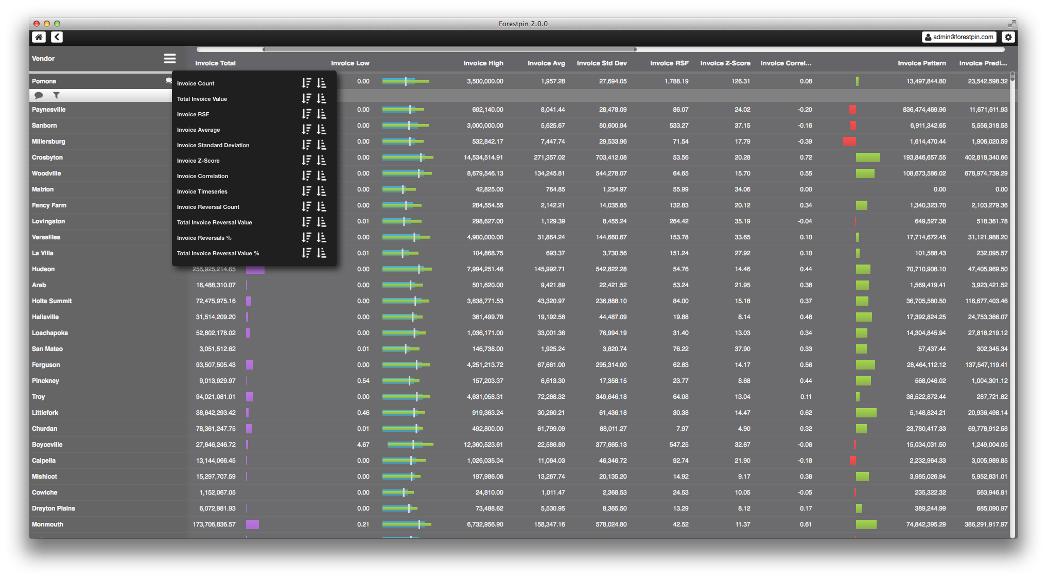
Account Based Analysis - Redesign

With the redesign, we display results of all analysis for each vendor in a table with inline visualizations. This easily beats what we had in previous version, because now the user is presented clearly with lot more information. The user can sort by results from any analysis to quickly find the red flags.

Timeseries Analysis
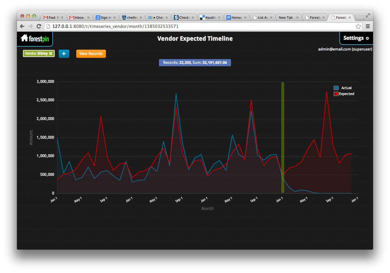
Timeseries Analysis - Old

This compares the predicted pattern with actual data to show whether there is a deviation. In the new version, we've taken this to whole new level with a beautiful bar graph by using color to indicate the deviation. With this design even someone with absolutely no knowledge of the dataset would be able to identify the troubling months.
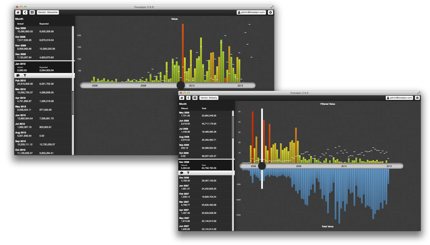
Timeseries Analysis - Redesign
///Forestpin Enterprise Redesign We released the new version of <<http://www.forestpin.com/(Forestpin Enterprise>> last week. The new version is a complete rewrite of both the backend and UI. The backend was rewritten to be faster and to introduce a bunch of new features and analytics. The user interface was redesigned to be much more user friendly and also with focus on mobile devices such as tablets. Teachings of visualizations experts such as Edward Tufte, Stephan Few and Naomi Robbins were followed during the user interface redesign. We have also changed the way we presented the results of analyses that existed in previous version as well. The images below are screenshots of the new version vs. the previous version and what made us make the changes. #Benford's Law Analysis <!> !img/forestpin_2014/2013-benford.png(Benford's Law Analysis - Old) In the previous version you could only see the distribution of number of transactions for each first two digit combination, whereas in the new version we display the distribution of the sum of values by first two digits. We are using the concept of **top-down** graphs to show two different related values, so that the users can come to better conclusions. <!> !img/forestpin_2014/2014-benford.png(Benford's Law Analysis - Redesign) For instance, with this top down display one can easily figure out that the spike in summation test at 29 (the downward orange bar) is due to a set of large valued transaction and not because there is a high number of transactions with FTD 29 (no spike in frequency distribution). Also we have colored the bars with a range of colors, unlike 3 colors in older version, to indicate the deviation. This makes it very easy to spot the red flags. #Duplicates Analysis <!> !img/forestpin_2014/2013-duplicates.png(Duplicates Analysis - Old) Many found the duplicates analysis in our previous version very useful; they also found the visualization very pretty. Still it could be improved. In the redesign, we have introduced a column on the left hand side to show the details (value, number of repetitions, average date, etc) about possible duplicated transactions. This is very useful to spot suspicious duplicates if you are familiar with numbers and the transaction values look odd. For instance, although you can infer the rough amount value from the position of the bubble you will have to select the bubble to find the exact amount. <!> !img/forestpin_2014/2014-duplicates.png((Duplicates Analysis - Redesign) Moreover, as you can see, we have also introduced sorting which is very useful in analysis duplicates, with our backend rewrite you can sort duplicates by different attributes almost instantaneously. #Account Based Analysis / Relative Size Factor Analysis <!> !img/forestpin_2014/2013-rsf.png(RSF Analysis - Old) The above visualization shows vendors with highest relative size factor; that is vendors with unusually large payments. The graph is in log scale with bottom being the average transaction value for each vendor and top being highest transaction value; therefore, the height of the bar is proportional to the log of RSF. <!> !img/forestpin_2014/2014-group.png(Account Based Analysis - Redesign) With the redesign, we display results of all analysis for each vendor in a table with inline visualizations. This easily beats what we had in previous version, because now the user is presented clearly with lot more information. The user can sort by results from any analysis to quickly find the red flags. #Timeseries Analysis <!> !img/forestpin_2014/2013-timeseries.png(Timeseries Analysis - Old) This compares the predicted pattern with actual data to show whether there is a deviation. In the new version, we've taken this to whole new level with a beautiful bar graph by using color to indicate the deviation. With this design even someone with absolutely no knowledge of the dataset would be able to identify the troubling months. <!> !img/forestpin_2014/2014-timeseries-correlation.png(Timeseries Analysis - Redesign)